


Sodexo Food Service @ Howard University
I truly enjoyed the opportunity to return to my alma mater and design for an audience I was once a part of while working with Sodexo. My goal was to create modern, vibrant, and student-focused designs that resonated with the campus community.
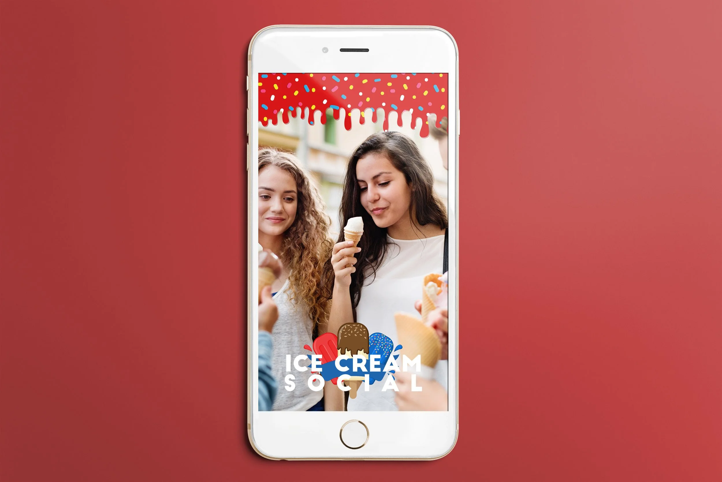
During my time there, I had the honor of designing a new representative logo for the café, reinforcing brand identity while maintaining a fresh, inviting aesthetic. Most of my work incorporated the school’s red and blue color palette to strengthen brand association, with occasional flexibility for themed campaigns.
To ensure consistency across marketing materials, I utilized a clean sans-serif typeface and introduced a low-opacity, repetitive food background across flyers, creating a cohesive visual identity. Each design was carefully adapted for both print and social media, optimizing layouts for different formats while preserving clarity and impact.